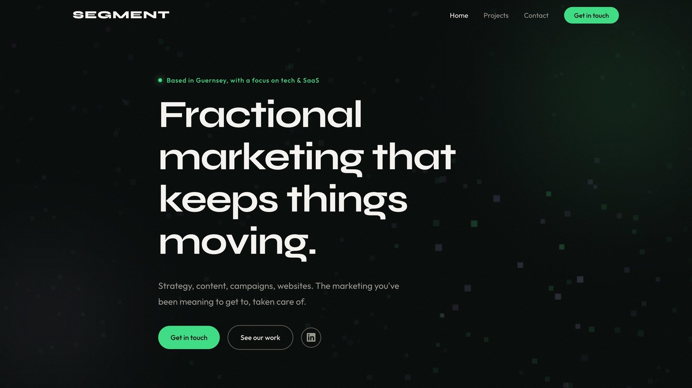
You're reading this on the site it's about, so treat it as a worked example. We built and rebuilt it for ourselves, with no deadline but our own, which is exactly the kind of project that quietly runs away from you. Here are the decisions that shaped it, and the ones we had to unmake along the way.
We left the builder on purpose
The first version lived in Framer. It's a strong tool and we still recommend it for plenty of jobs. For our own site we wanted something different: full control of the output, and the freedom to change anything without the platform having an opinion. As the Framer version grew, the design started bending around the tool rather than the other way round.
So, we rebuilt it by completely starting over. The principle worth taking from it: choose your tools for the kind of control the work needs. For a quick microsite, a builder is the right answer. For the thing that represents you, owning the code earns its keep, because every compromise the platform forces is one your audience eventually feels.
How it's built and hosted
Under the surface it's deliberately simple, and that's a decision in itself. The site is plain HTML, CSS, and a little JavaScript. No framework, no build step, nothing clever that needs maintaining.
The code lives in a GitHub repository, which is the single source of truth. Every change is a commit, so we can see exactly what changed and when, and undo anything that goes wrong without drama.
Netlify is wired to that repository. When we push a change to GitHub, Netlify rebuilds and publishes the site within seconds, on its own. No uploading files, no server to keep patched, nothing to log into. Push, and it's live.
Hosting is free at our scale. The only thing we pay for is the domain: a .gg domain, which suits a Guernsey studio, found for under £50 a year through a registrar a friend put us onto. The big-name registrars wanted a good deal more for the same name.
It's a straight-forward combination that is exactly what we wanted: cheap, fast, and entirely ours, with no platform that can change its pricing or its rules from under us. For the site that represents your business, that's worth more than any feature a builder could bolt on.
Looking good was not the same as being right
The first direction we designed was genuinely nice: soft shapes, earthy colours, natural type. We built it out, sat with it, and scrapped it. Not because it was poor work, but because it was the wrong work. It looked like a surf brand, and whilst we loved the look, it just doesn't resonate with our clients or what we do.
This is the call we see businesses get wrong most often: judging a brand on whether it's attractive rather than whether it's aligned. We work mostly with tech and SaaS, so the site had to signal that we speak that language. But plenty of our clients aren't software companies, and the look couldn't be so coded to tech that they felt shut out. What we landed on was confident and modern, warm without being soft, technical without being cold.
Scrapping finished work is the part most people avoid. It's also the fastest way to be sure of the version you keep.
The palette had to become a system
Our colours came from things we already had rather than a generator. Green (#3DDC84) was there from the start. The gold (#F6D764) is lifted straight off a lime in our hero photo. Lavender (#B8A9E8) came later as a quieter third.
The colours themselves are the easy part. What makes them a brand is the rule behind each one: gold for anything you can click, green for identity and status, lavender kept in the background. This gives the site consistency and makes it easier to use.
The pixel effect had to earn its place
The homepage interaction took more iterations than anything else, and most of them we threw away. Some looked impressive but said nothing. Some were too playful for the audience. Some sat too close to effects we'd seen elsewhere.
We kept going because an effect that doesn't serve the positioning is just noise, however good it looks. The pixel treatment we settled on does specific work: it adds movement without taking over, it reads as digital without the tired tech clichés (hopefully!), and it carries across the site so the hero and the About section feel like one idea. That's the bar we'd set for any interaction. If you can't say what job it's doing, cut it.
How we used AI
We built the site with Claude Code, an AI coding tool.
The tool is great but needs a lot of clear direction. We decided the layout, the type, the colours, the copy, and the interactions; it produced the code; and the value we added was the judgement in between.
The honest numbers
For anyone who's interested in doing a similar build, here's what it cost us:
- Time: around 40 hours, spread over a few weeks of evenings.
- Domain: under £50 a year for a .gg domain.
- Hosting: £0 on Netlify.
- Tools: £20 per month for Claude.
A lot of hours have gone into the website, and we've got a backlog of changes and updates we'll continue with. The freedom this setup provided us is worth the extensive build.
Owning it changed how we work
The real payoff arrived after launch. Small updates stopped feeling expensive, so we make them. Ideas are cheap to test, so we test more. The site became something we shape week to week rather than a platform we'd have to migrate off in eighteen months. For any business, that's the quiet argument for owning your own tools: it lowers the cost of every decision that comes after.
What we'd take into the next build
- Settle the positioning before the visuals. Every design decision gets easier once the strategic ones are made.
- Write the words before the layout. Design around real copy, not placeholder boxes.
- Decide what "done" looks like, and ship when you hit it. We kept adding things out of perfectionism, when most of them could happily wait for a later version. A clear finish line is the only thing that stops a project like this running forever.
- AI can build it; only you can judge it. Claude Code can build almost anything you can describe. It can't tell you whether the thing is any good, or worth building. That part is still yours, and it's the part that counts.
- Check the work. AI-written code reads as confident even when it's broken. None of our bugs were loud. They were stray tags and sizing quirks you only find by looking.
Would we do it again?
Yes, scrapped direction and all. If you care about how your brand is built and you want to keep your hands on it, owning the site is worth the work. If you'd rather move quickly and never think about it again, a builder will serve you well, and we'd tell a client exactly that.
This is the first of our Fieldnotes, where we keep showing the decisions behind the work. If there's a call you're weighing on your own brand, we're happy to talk it through.